art direction
graphic design
illustration
brand identity
design thinking
creative consulting
art direction graphic design illustration brand identity design thinking creative consulting

Fable Café
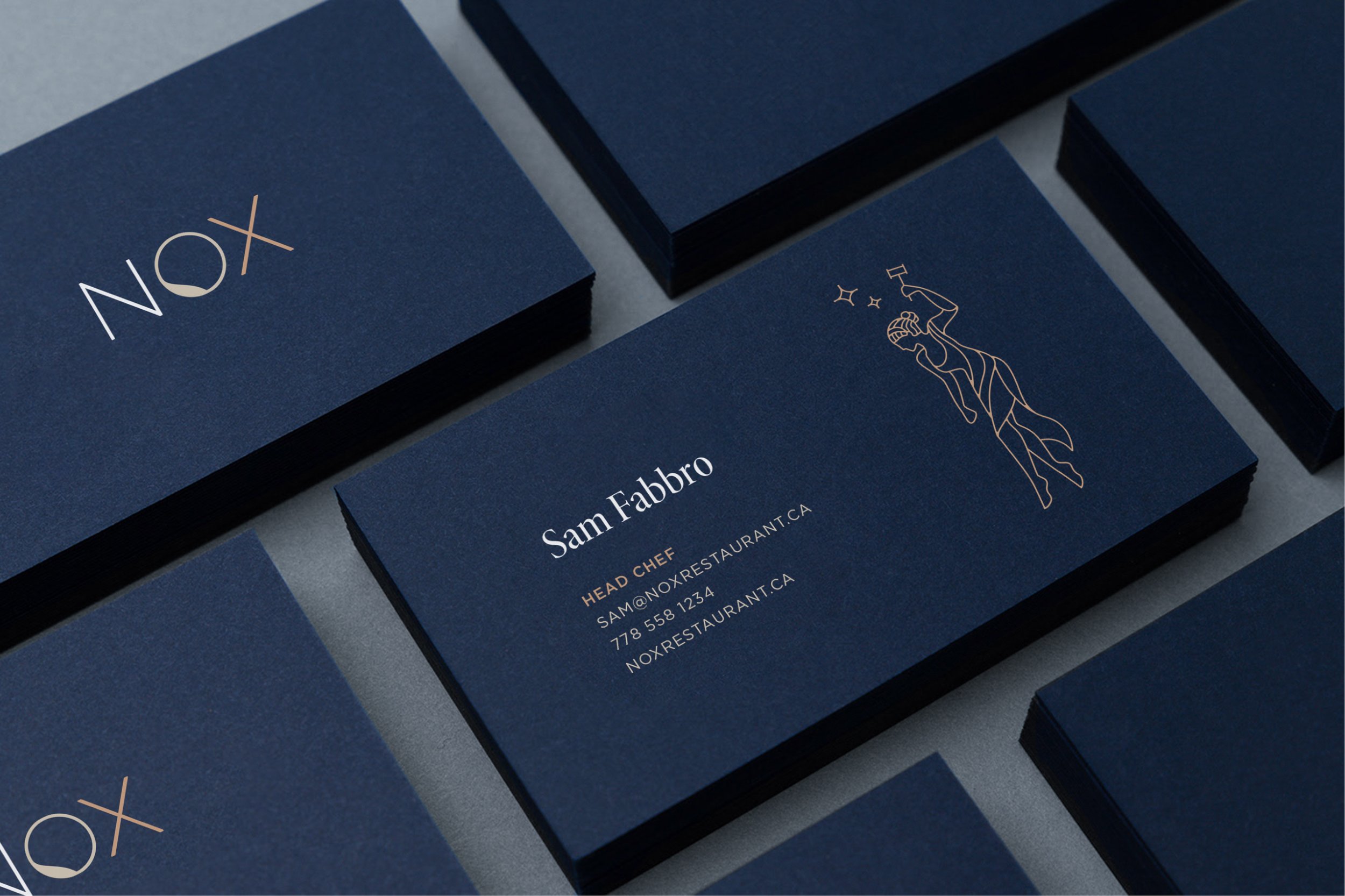
Nox Restaurant
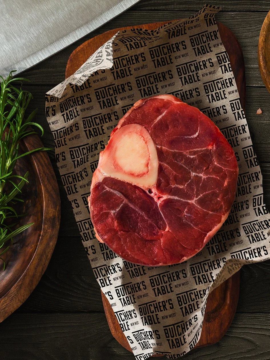
Butcher's Table
Amaranthus

Forager Gluten Free Lager

lululemon Sheer Joy Jacket

lululemon Feel Good Giving

Spoonmade
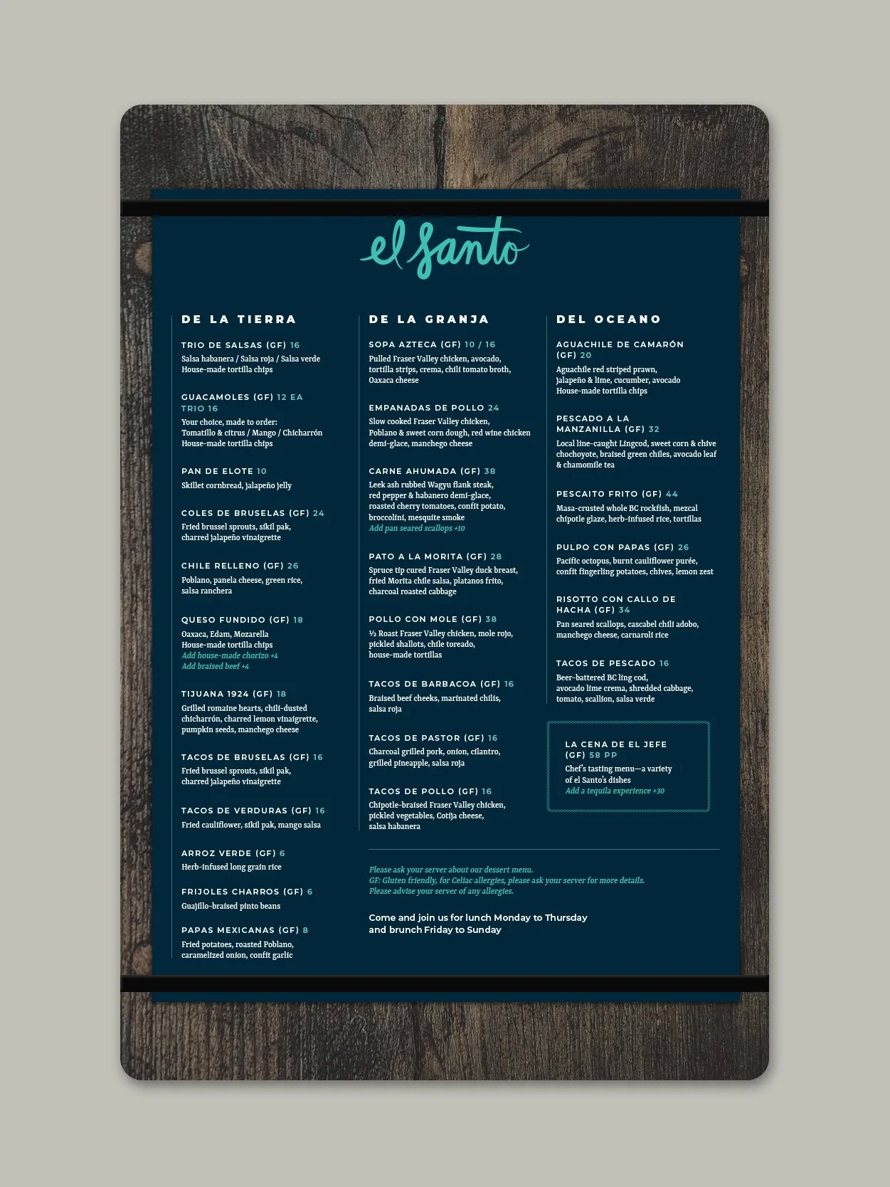
el Santo Restaurant

lululemon Jaquard Camo
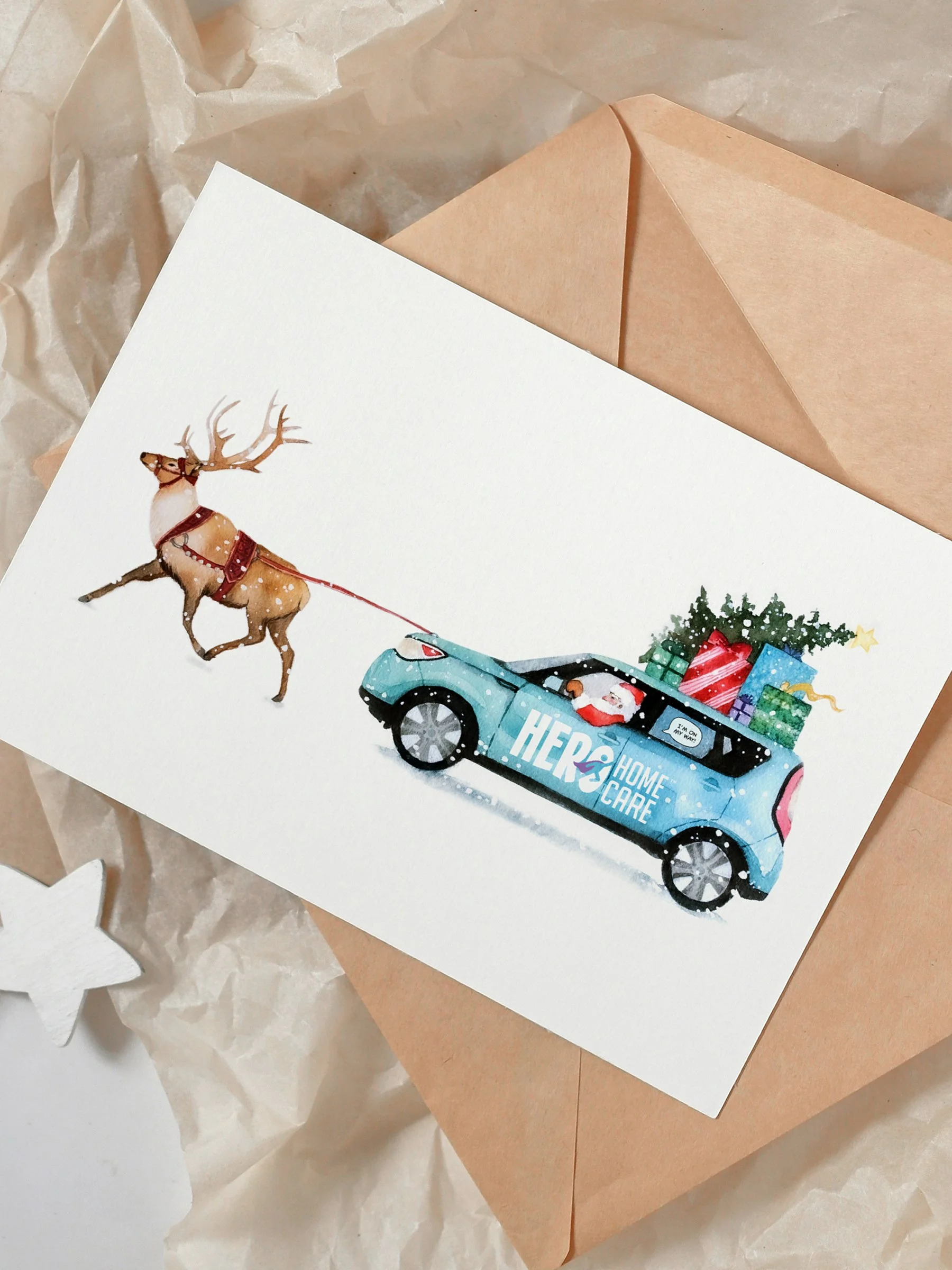
Hero Homecare